Image placeholder

Building Responsive Websites with Bootstrap: A Comprehensive Guide

Share:
3:40 PM, Jun 21, 2024 / By ABC Trainings
Updated on 3:40 PM, Jun 21, 2024

Introduction:

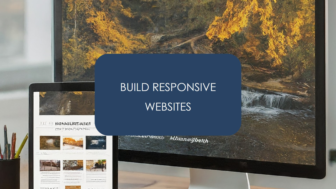
In today's digital landscape, a website that looks great on a desktop computer but becomes clunky and unreadable on a mobile device is a recipe for lost visitors and frustrated users. Responsive web design, the art of crafting websites that adapt seamlessly across various screen sizes, has become an absolute necessity.

This blog post delves into Bootstrap, a popular front-end framework that equips web developers and designers with the tools to build responsive websites efficiently and effectively. Whether you're a seasoned developer or just starting your web development journey, Bootstrap can be a valuable asset in your toolkit.

What is Bootstrap?

Bootstrap is a free and open-source front-end framework created by Twitter. It provides a collection of pre-built components like buttons, forms, navigation bars, and more, along with a robust grid system and a suite of customizable CSS classes. By leveraging these tools, developers can streamline the website development process, ensure consistency across web pages, and most importantly, build websites that adapt flawlessly to any device.

Benefits of Using Bootstrap for Responsive Web Design


  • Rapid Development: Bootstrap's pre-built components act as building blocks, allowing developers to skip the tedious task of coding individual website elements from scratch. This translates to faster development times and increased efficiency.
  • Consistent Design: Bootstrap's components share a unified design language, ensuring a visually cohesive website experience across all pages. This promotes brand recognition and user trust.
  • Mobile-First Approach: As mentioned earlier, Bootstrap prioritizes mobile responsiveness. This ensures your website looks its best and functions flawlessly on smartphones and tablets, the devices users access the web with most frequently.
  • Wide Browser Compatibility: Bootstrap ensures your website renders consistently across different web browsers, eliminating compatibility issues and providing a smooth user experience for everyone.
  • Extensive Customization Options: While Bootstrap offers pre-built components, it doesn't restrict your creativity. You can leverage CSS to customize the look and feel of these components to perfectly match your brand identity and design preferences.
  • Large and Active Community: Bootstrap boasts a vast and supportive online community. If you encounter any challenges or have questions, there's a wealth of resources available online, including forums, tutorials, and documentation.

Key Bootstrap Features for Responsive Design


  • Grid System: The cornerstone of responsive design in Bootstrap is its grid system. This system utilizes a series of rows and columns to structure your website layout. Depending on the screen size, Bootstrap automatically adjusts the layout to ensure optimal viewing. For example, a three-column layout on a desktop might transform into a single column on a mobile device.
  • Responsive Utility Classes: Bootstrap provides a set of utility classes that allow you to fine-tune the responsiveness of your website elements. These classes control aspects like visibility, padding, margins, and more at specific screen sizes.
  • Media Queries: Media queries allow you to target specific CSS styles based on screen size or device orientation. This enables you to create a more granular level of responsiveness for your website.

Learning Bootstrap: Getting Started

There are numerous resources available to help you learn Bootstrap and unlock its potential for responsive web design:


  • Official Bootstrap Documentation: The official Bootstrap website offers comprehensive documentation covering all aspects of the framework, including detailed explanations, code examples, and tutorials.
  • Online Courses: Several online platforms offer video courses and tutorials dedicated to learning Bootstrap. These courses can provide a structured learning experience with interactive exercises and quizzes.
  • Books and Tutorials: Many books and online tutorials delve into Bootstrap in detail, offering a step-by-step approach to mastering the framework.

Conclusion:

By leveraging the power of Bootstrap, you can streamline the responsive web design process, build beautiful and user-friendly websites, and ensure a positive user experience across all devices. So, embrace Bootstrap, join the vibrant Bootstrap community, and start building responsive websites that capture attention and leave a lasting impression!

Ready to take your web development skills to the next level? Consider enrolling in ABC Trainings' comprehensive Bootstrap program. We'll equip you with the knowledge and expertise to become a Bootstrap pro!

Share your web development challenges and Bootstrap questions in the comments below. Let's build a community of passionate developers who are dedicated to creating exceptional web experiences!

#ABCTrainings #WebDevelopment #Bootstrap #ResponsiveWebDesign


Join the ABC Trainings Community!

Expand your design and tech knowledge by following us on social media for daily tips, industry insights, and exclusive announcements:


Don't forget to share this article with your network!

By sharing valuable content, we can help more people develop their design and tech skills. Let's spread the knowledge together!

#ABCTrainings #DesignChallenge #TechSkills #Upskilling

Leave a Comment Below!

We value your feedback and questions. Let us know your thoughts on today's topic in the comments section below. We're here to create a collaborative learning environment for everyone.